Graphic design

Fit4Kids

2023-10-21T10:13:19+02:0009 September 2021|

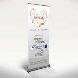
What does a healthy breakfast look like? How do I behave in an emergency? How do I become more self-confident? The FREYwillig & mit Herz initiative, the Protestant Hospital Dierdorf/Selters and the medical care centres of the KHDS jointly provided answers to these questions and many other interesting facts about health and strong, courageous children at a health day for schools under the motto "Fit4Kids" summarised.

I am pleased to be able to help this project with various advertising measures.

Focus on humanity and sustainability

2024-02-15T10:50:57+01:0029 August 2021|

The AWO Siegen consistently pursues the idea of inclusion and solidarity with its facilities. Hotel Fünf10, Restaurant Fünf10 and the Academy Nine10 around. In this way, the vision of equal participation and sustainable integration of people with disabilities into the world of work is pursued. The employees with and without disabilities are a well-rehearsed team and work hand in hand - in such a way that everyone can contribute their individual potential. In addition, the projects have a natural, resource- and climate-friendly concept.

I am very pleased to be able to support these organisations with various advertising measures.

Cornelia Bauer: Focus on selling

2023-10-21T10:25:44+02:0029 June 2021|

Sales is more than just selling products or services, the customer needs a holistic strategy. Cornelia Bauer works face to face or in small groups with comparable target groups in her sales training and analyses where the relevant customers can be found, how to look after them perfectly, retain them and turn them into enthusiastic regular customers, because professional training is necessary and essential for success in sales. I am happy to support you with the appropriate advertising materials.

Tips & Tricks No.6

2023-11-17T10:25:30+01:0016 June 2021|

neunmalklug from vh-crossmedia

In the "neunmalklug" section, I publish tips, tricks and technical information about graphic and web design at irregular intervals. Today:

Graphic design basics: Balance

Here is 9 x expertise on the topic of "balance" in graphic design:

  1. Symmetry and asymmetry: The use of symmetrical or asymmetrical arrangements of visual elements to create a balanced and harmonious overall picture.
  2. Proportions and proportions: The use of proportions and proportions to create a balanced and harmonious overall picture.
  3. Colour contrasts: The use of colours to distinguish visual elements from one another or to highlight certain areas.
  4. Negative space or white space: The use of empty space or white space around visual elements to draw focus to certain areas or achieve a desired effect.
  5. Hierarchy: The use of space to create a hierarchy of visual elements and help the viewer quickly grasp the most important information on a page.
  6. Spacing: The placement of visual elements at a certain distance from each other to create a balanced overall picture and facilitate the perception of content.
  7. Text and image distribution: The distribution of text and image elements in space to create a balanced and more legible composition.
  8. Contrast: The use of contrasts in size, shape or colour to create a balanced overall picture and highlight visual elements.
  9. Structure: The use of space to create a clear structure and organisation of visual elements and to achieve a balanced overall picture.

Fancy applying these tips to YOUR project?
I look forward to hearing from you!

Tips & Tricks No. 5

2023-11-17T10:25:32+01:0016 February 2021|

neunmalklug from vh-crossmedia

In the "neunmalklug" section, I publish tips, tricks and technical information about graphic and web design at irregular intervals. Today:

Graphic design basics: Hierarchy

Here is 9 x expertise on the topic of "hierarchy" in graphic design:

  1. Size and weight: Use different sizes and weights of fonts to create visual hierarchies and emphasise important information.
  2. Colour: Use of colours to create visual hierarchies and highlight important information.
  3. Position: Placement of visual elements at strategic points on a page to convey the importance and sequence of information.
  4. Contrast: Use of contrasts in colour, size and shape to create visual hierarchies and highlight important information.
  5. Consistency: Use of consistent visual elements to create a clear hierarchy and facilitate the perception of content.
  6. Attention: Use of visual elements to draw the viewer's attention to important information.
  7. Shape: Use of shapes to create a clear hierarchy of visual elements and emphasise important information.
  8. Visual language: Use of visual language to convey complex information quickly and simply and to create a clear hierarchy of information.
  9. Negative space or white space: Use of empty space or white space around visual elements to focus on specific areas and create a clear hierarchy.

Should we use these tips together?
I look forward to helping you further!

Christmas is coming ...

2021-02-05T14:56:25+01:0029 December 2020|

As every year, the task in 2020 was to create Christmas design templates for my customers' cards. A large selection of individual layouts makes every Christmas greeting unique.

vh-crossmedia | leaflets, folders, flyers

Tips & Tricks No. 4

2023-11-17T10:25:35+01:0016 December 2020|

neunmalklug from vh-crossmedia

In the "neunmalklug" section, I publish tips, tricks and technical information about graphic and web design at irregular intervals. Today:

Graphic design basics: Colour

Here is 9 x expertise on the subject of "colour" in graphic design:

  1. Colour psychology: Colours have a psychological effect on the viewer and can evoke emotions.
  2. Colour combinations: Choosing the right colour combinations is crucial to achieving a visually appealing design.
  3. Contrast: The use of contrasting colours can help to highlight important information and improve readability.
  4. Colour saturation: The saturation of colours influences their effect on the viewer.
  5. Choice of colour: The right choice of colour is important to communicate the identity and personality of the brand.
  6. Colour gradients: Colour gradients can be used to create smooth colour transitions and improve visual depth.
  7. Colour tone: The colour tone of colours is important to convey the mood and atmosphere.
  8. Colour theory: Understanding colour theory can help to achieve a visually appealing design.
  9. Colour contrast: The contrast between the colours is important to improve readability and the visual hierarchy in the design.

Fancy applying these tips to YOUR project?
I look forward to hearing from you!

Go to Top