Tips & Tricks

Tips & Tricks No. 25

2025-07-15T11:30:48+02:0015 July 2025|

neunmalklug from vh-crossmedia

In the "neunmalklug" section, I publish tips, tricks and technical information about graphic and web design at irregular intervals. Today:

9 elements that should not be missing on any homepage

The homepage is much more than just the entry point to a website. It is the digital business card, the first point of contact - and often the decisive one. The decision is made within a few seconds: continue reading or jump off? As a web designer, I therefore make sure that certain elements are well thought out and clearly implemented right from the start.

Here are nine central building blocks that I consider together with my clients when designing each homepage:


  1. Visual introduction: hero motif, slider or strong visual language

The first glance is decisive - and it should be a good one. Whether it's a large-scale hero motif, a customised slider or a short video clip: together we choose the right visual element that gets to the heart of the website's message and draws visitors' attention. I make sure that design and technology work together perfectly - for a professional, inviting and brand-typical first impression.

  1. Clear address: Headline with value proposition

A homepage needs more than just a "Welcome" - it needs orientation. Together with my clients, I develop a concise headline that clearly shows what the company offers - and why this is relevant for the target group. A well thought-out introduction creates trust and arouses interest.

  1. Link to social media: show presence where the target group is on the move

Whether Instagram, Facebook, LinkedIn or YouTube - if you are active on social networks, you should also make these channels visible on your website. I integrate social media links, feeds or individual posts in such a way that they match the design and offer real added value. Together, we clarify which platforms make sense and how a link can be harmoniously integrated. The result is a coherent presence - across all channels.

  1. Service overview or offer teaser

What exactly does the company offer? Together, we prioritise the content that should be the focus - and I develop design solutions that present the services in a clearly structured and visually appealing way. Even complex topics can be made easily accessible with modular teasers, icons or short descriptions.

  1. Call to action

Whether it's an appointment, contact form or product page - it should be recognisable on the homepage what should happen next. Together, we define the goal of the page and I make sure that suitable call-to-actions are placed sensibly and implemented in a visually convincing way. This creates clear user guidance without detours.

  1. Current content, references or customer testimonials

A website is allowed to live - this conveys topicality and seriousness. Depending on the project, I develop suitable options for integrating news, selected references or customer opinions. Even if no news section is planned, content can be presented in a targeted manner so that it is effective - without the need for constant maintenance.

  1. Contact option or direct link

A good website makes it easy to get in touch. I make sure that all important contact options are clearly visible and can be used on mobile devices - whether as a button, as fixed information in the header or as a short form in the footer. Here too, we work together to decide what suits the target group and the project.

9 elements that should not be missing on any homepage
  1. Sophisticated navigation and user guidance

You can't see good menu navigation - you can feel it. I develop a clear structure that is logically organised and works intuitively on all devices. I pay attention to short click paths, comprehensible labelling and a clear hierarchy that makes visiting the site pleasant and goal-oriented.

  1. Technical basics: loading time, mobile view, data protection

Design only works if the technology is right. I pay attention to clean code, fast loading times, an optimised display on mobile devices and the implementation of all legally required elements - from the cookie banner to the privacy policy. The result is a reliable, future-proof website.


These nine elements form a strong foundation for homepages that are convincing - visually, structurally and technically. In every project, I develop customised solutions that precisely match the requirements and target groups of my clients. The order of the points is not a fixed rule, but results from the respective concept. The decisive factor is that the overall picture is right - in terms of function, design and content.

Do you want your homepage to impress from the very first click? I can help you achieve this!

Tips & Tricks No. 24

2025-01-09T08:28:54+01:0009 January 2025|

neunmalklug from vh-crossmedia

In the "neunmalklug" section, I publish tips, tricks and technical information about graphic and web design at irregular intervals. Today:

The 9 most common mistakes with self-created websites - and how I avoid them for you

Creating a website yourself sounds tempting: with modular systems and DIY tutorials, the path to your own online presence seems quick and inexpensive. But many people quickly realise that a professional, functioning and customer-friendly website is more demanding than they thought.

From my conversations with customers who have started with modular systems such as Strato or 1&1, I know that many find the creation process more time-consuming and complicated than expected. The results often fall short of expectations. Content management systems such as Typo3 (often perceived as too complicated) and Joomla (less widespread and therefore offering less support) can also present challenges. I prefer to work with WordPress as it offers an ideal combination of flexibility, user-friendliness and a large community. This makes it easy to realise individual requirements without making compromises.

The 9 most common mistakes with self-created websites - and how I avoid them for you

As a result, many self-employed people and companies encounter challenges when implementing their own websites that lead to avoidable mistakes. Here are the 9 most common mistakes - and how I can help you avoid them:


1. lack of mobile friendliness
More than 70 % of internet users visit websites via their smartphone. A website that is poorly displayed on mobile devices deters visitors. Modular systems in particular often do not offer optimal mobile customisation. Professional responsive design ensures that your website looks and functions optimally on all devices.


2. confusing layout
If visitors can't find your content quickly, they'll leave. DIY solutions such as modular systems or standard CMS templates often only offer limited options for a clear structure and intuitive navigation. I help you to structure content clearly and develop a design that takes your customers by the hand.


3. poor loading times
A slow website costs visitors and search engine rankings. This can be caused by unoptimised images, too many plugins or inefficient code - a common problem with self-created websites. I technically optimise your website so that it loads at lightning speed.


4. outdated or inappropriate design
A website is your digital figurehead. Self-created pages often appear arbitrary or out of date. A professional design shows at first glance that your company is modern and trustworthy.


5. no clear target group approach
Many DIY sites are too general or do not address the target group directly. I analyse your target group and ensure that your website reaches exactly the people you want to address.


6. lack of search engine optimisation (SEO)
Without SEO, your website remains invisible. Important factors such as keywords, meta tags or structured content are often overlooked. I make sure that your website is not only attractive, but also findable.


7. too little focus on content
The design is often prioritised, while the content is neglected. But it is the texts, images and messages that convince your visitors. Together, we ensure that your content is appealing and effective.


8. security gaps
DIY sites are often not sufficiently protected against cyber attacks. If SSL certificates, regular updates or secure passwords are missing, your site will quickly become a target for hackers. I integrate modern security standards and ensure regular maintenance.


9. no professional support
What to do if the site suddenly stops working? Websites that you create yourself usually do not offer any technical support. As your partner, I am also there for you after completion to solve problems quickly.


Creating a website yourself can therefore quickly become frustrating and expensive if errors occur that put off visitors or potential customers. With my expertise, you can avoid these stumbling blocks and get a website that is technically, visually and content-wise convincing.

Do you want a website that not only looks good, but also works? Let's develop a solution together!

Tips & Tricks No. 23

2024-11-01T14:18:46+01:0001 November 2024|

neunmalklug from vh-crossmedia

In the "neunmalklug" section, I publish tips, tricks and technical information about graphic and web design at irregular intervals. Today:

9 steps to the successful launch of your new website

  1. Fine-tuning the content: The first important step is to review and optimise all text and images. Together, we go through all content to ensure it is clear, engaging and aligned with your target audience. Precisely worded copy, meaningful images and a consistent tone of voice help to communicate your brand and gain the trust of visitors.
vh-crossmedia - Launch of your new website: fine-tuning the content
  1. Design optimisation: The second step is perfecting the design. Here I pay attention to the smallest details - from the fonts to the colour combinations. A coherent design represents your brand perfectly and ensures that visitors to your website have an unforgettable experience. Studies show that visually appealing websites increase user dwell time and reduce the bounce rate.
vh-crossmedia - Launch of your new website: Design optimisation
  1. Responsive design: The next step is to ensure that your website is optimally displayed on every device. Whether on a smartphone, tablet or desktop - your website must work perfectly everywhere. I test on different screen sizes and adapt the design to ensure a consistent user experience. A responsive design increases user satisfaction and increases the chances of visitors staying longer and converting.
vh-crossmedia - Launch of your new website: Responsive Design
  1. Intuitive navigation: Clear and intuitive navigation is the key to a good user experience. I structure the menus so that your visitors can find what they are looking for quickly and easily. For example, clear menu items and a well thought-out page structure ensure that users can navigate through your content with ease. Well-organised navigation can significantly increase the conversion rate.
vh-crossmedia - Launch of your new website: Intuitive navigation
  1. Convincing call-to-actions: Targeted calls to action can make the difference between a visitor and a customer. I strategically place CTAs and optimise them to align with your business goals. Whether it's a "buy now" button or a "contact us" form, CTAs are regularly tested and customised to achieve the best possible conversion rate.
vh-crossmedia - Launch your new website: Convincing call-to-actions
  1. Search engine optimisation (SEO): A website is only as good as its findability. Through targeted SEO measures such as optimising keywords, improving loading times and adapting mobile user-friendliness, I ensure that your website ranks high in Google's search results. This means more visibility, more visitors and ultimately more potential customers for your business.
vh-crossmedia - Launch of your new website: Search engine optimisation (SEO)
  1. Integration of social media: Social media is a powerful tool to increase your reach and encourage interaction with your customers. I integrate social media buttons and feeds on your website so that visitors can easily share your content or connect with your channels. Integration options such as Instagram galleries can also increase engagement.
vh-crossmedia - Launch of your new website: Integration of social media
  1. Safe transition: The launch of your website is a sensitive process that leaves no room for error. I take care of the technical implementation, such as adjusting the server settings and migrating the content to ensure a smooth transition. I make sure that the website remains secure and error-free during the transition so that you can concentrate on your business.
vh-crossmedia - Launch of your new website: Secure transition
  1. Personalised support for you: I am also there for you after the launch. Be it for technical questions, content adjustments or new features - I support you in constantly improving your website. Through regular analyses and updates, we ensure that your website is always up to date and continues to perform optimally.
vh-crossmedia - Launch of your new website: Personal support for you

Are you ready to launch your new website with a strong presence?
Let's write your digital success story together!

Tips & Tricks No. 21

2024-08-09T07:30:45+02:0026 June 2024|

neunmalklug from vh-crossmedia

In the "neunmalklug" section, I publish tips, tricks and technical information about graphic and web design at irregular intervals. Today:

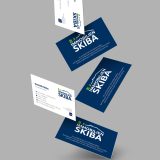
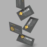
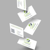
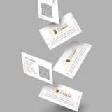
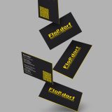
9 arguments in favour of classic business cards

Business cards have been an essential part of business life for centuries. Despite the digital age, they have maintained their place.

In a world where digital communication is becoming increasingly important, the classic business card remains a valuable tool for personal and professional communication. It combines tradition with functionality and offers numerous advantages that are often lost in the digital space. In this blog article, I highlight the advantages of classic business cards and also discuss the modern version with a scannable QR code.

  1. Personal contact
    Business cards enable a direct and personal exchange. Handing over a card creates a moment of connection that is often not achieved by digital means.
  2. First impression
    A well-designed business card can make a lasting first impression. It reflects professionalism and care and can impress potential customers or partners.
  3. Tangibility
    Physical business cards are tangible and can be easily stored or passed on. They serve as a constant reminder of an encounter or a business transaction.
  4. Creative design options
    The design options for physical business cards are diverse. Different types of paper, printing techniques and finishes such as embossing or varnishing offer creative freedom.
  5. Eye-catching design
    Special design elements such as a colour cut (on the edges of the business card) or special materials make your business card a real eye-catcher and make you stand out from the crowd.
  6. Immediate access to information
    Business cards offer a quick way to pass on contact details and important information without the need for technical devices.
  7. Extended information
    A QR code on the business card makes it possible to provide more information than would fit on a conventional card. By scanning the code, contact details, websites, social media profiles and more can be stored directly on the smartphone.
  8. Timeliness and flexibility
    QR codes allow the digital content to which they refer to be updated at any time. This means that changes to contact details or additional information can be easily adapted without having to print new cards.
  9. Combination of physical and digital
    Business cards with a QR code combine the advantages of the physical and digital worlds. They offer the feel and personal touch of a classic business card, while at the same time providing access to more comprehensive and up-to-date digital information.

The modern business card with QR code

Imagine you receive a business card from a business partner. At first glance, it looks like a classic business card: high-quality paper, attractive design. But there is a QR code on the back. You pull out your smartphone, scan the code and a mobile website opens with all the relevant information - from contact information and social media links to a link to a current project or portfolio. The data is always up to date and you can save it directly in your address book.

As a professional graphic designer, I offer you the design of classic business cards that are not only aesthetically pleasing, but also effectively communicate your brand and personality. Whether traditional or with an integrated QR code - I design business cards that optimally fulfil your needs and leave a lasting impression. Utilise the advantages of classic business cards to impress in personal contact and at the same time build a bridge to the digital world with modern elements such as QR codes. Let's design your perfect business card together!

Tips & Tricks No. 20

2024-08-09T07:31:09+02:0022 March 2024|

neunmalklug from vh-crossmedia

In the "neunmalklug" section, I publish tips, tricks and technical information about graphic and web design at irregular intervals. Today:

9 tips on how I can help you shine with your website in the digital space

In today's digital world, creating a website is an art that balances aesthetics and functionality. From adapting to different devices to clearly communicating your brand message, every detail counts.

Here are nine practical tips to make sure your website not only looks great, but also achieves your goals. From usability to security, I'll show you how to make your online presence a success. And as an experienced graphic and web designer, I'm here to help you bring your vision to life.

  1. Responsive design - a website that adapts
    Your website should look and function well on all devices, whether desktop, tablet or smartphone. As a professional, I can ensure that your pages have a consistent and appealing appearance.
  2. User-friendliness (usability) - easy to navigate
    Clear and intuitive navigation makes it easier for your visitors to find their way around your website and find the information they need quickly. By designing user-friendly menus and buttons, I ensure that your content is easily accessible.
  3. Load time optimisation - fast and responsive
    As a web designer, I can ensure that your website not only loads quickly, but is also responsive. By optimising image sizes, minimising scripts and choosing an efficient hosting service, I ensure that your website offers a smooth experience even on slow internet connections.
  4. Call-to-actions - clear calls to action
    Guide your visitors with clear calls to action to carry out the desired actions, be it filling out a contact form, requesting a quote or purchasing a product.
  5. Barrier-free design - accessibility for all
    Your website should be accessible to everyone, regardless of any restrictions. Pay attention to clear contrasts, easy-to-read fonts and user-friendly navigation.
  6. Search engine optimisation (SEO) - Visibility on Google & Co.
    Ensure that your website is easily found in search engines such as Google by using relevant search terms and optimising your pages for search engines.
  7. Integration of analysis tools - understand your visitors
    Use analytics tools such as Matomo to understand your visitors' behaviour and adapt your website accordingly to increase conversions.
  8. Security - protect your data
    Your website should be secure in order to protect sensitive data and gain the trust of your visitors. As a web designer, the security of your website is important to me. I implement robust security measures to protect sensitive data and close potential security gaps. From regular security updates to implementing SSL certificates, I work to make your visitors feel safe and confident in your website.
  9. Content that inspires - convincing content
    Provide high quality and relevant content that engages and informs your visitors. Good content is crucial to keep your target group interested and encourage them to come back.

These tips will help you create a website that is not only aesthetically pleasing, but also functional and successful in achieving your goals.

As an experienced graphic and web designer, I have the expertise and creative skills to translate your vision into a stunning website that incorporates all of the above tips. From conception to realisation, I'll be by your side to ensure your website is not only aesthetically pleasing, but also functions optimally and supports your goals. Contact me today to work together to create your unique online presence and strengthen your brand in the digital space.

Tips & Tricks No. 19

2024-08-09T07:31:29+02:0014 February 2024|

neunmalklug from vh-crossmedia

In the "neunmalklug" section, I publish tips, tricks and technical information about graphic and web design at irregular intervals. Today:

Interactive design: 9 questions on the integration of animations, hover effects and scroll animations

  1. Why is interactive design important for the user experience (UX) of a website?
    Interactive design improves user interaction and increases engagement by allowing visitors to actively interact with the website. This improves the overall user experience and increases the likelihood that visitors will stay on the website and return.
  2. Which interactive elements can be integrated into the design of a website?
    Interactive elements include animations, hover effects, scroll animations, interactive forms, clickable elements, drag-and-drop functions and much more. The choice depends on the objectives of the website and the needs of the users.
Volker Heupel | vh-crossmedia: Interactive design - interactive elements in web design
  1. How can animations improve the user experience?
    Animations can improve user guidance, attract attention, visualise information, provide feedback and create a fluid and engaging user experience.
  2. What role do hover effects play in interactive design?
    Hover effects allow users to see additional information when they interact with an element, for example by moving the mouse pointer over it. They can be used to emphasise navigation elements, display additional information or add visual effects.
Volker Heupel | vh-crossmedia: Interactive design - interactive elements in web designVolker Heupel | vh-crossmedia: Interactive design - interactive elements in web design
  1. How can scroll animations improve website interaction?
    Scroll animations can help to present content on a website in an appealing way by bringing elements into view when scrolling, triggering animations or smoothing transitions between sections. This makes the user experience more dynamic and interesting.
  2. Which best practices should be observed during integration?
    Interactive elements should be subtle and not overwhelming, not affect the loading time of the website, be accessible and provide consistent feedback. They should also complement the overall design of the website and not distract from it.
Volker Heupel | vh-crossmedia: Interactive design - interactive elements in web design
  1. How can you ensure that interactive elements work well on different devices and screen sizes?
    It is important to design interactive elements responsively so that they work well on different devices and screen sizes. This requires thorough testing and adapting the elements to different resolutions and input methods.
  2. How can interactive design help to strengthen the brand identity of a website?
    By communicating brand values and characteristics in innovative ways, interactive elements can help to strengthen brand identity and improve the brand experience for users.
Volker Heupel | vh-crossmedia: Interactive design - interactive elements in web design
  1. How does your website benefit from the integration of interactive elements?
    Your website could benefit from interactive elements in that they can increase user engagement, strengthen brand awareness and improve conversion rates. By creating a dynamic and engaging user experience, you can communicate your message more effectively and achieve your goals. It is important to use interactive elements in a targeted way to meet the specific needs and objectives of the website.

Fancy applying these tips to YOUR project?
I look forward to hearing from you!

Tips & Tricks No. 18

2024-08-09T07:31:37+02:0008 December 2023|

neunmalklug from vh-crossmedia

In the "neunmalklug" section, I publish tips, tricks and technical information about graphic and web design at irregular intervals. Today:

9 terms that have made it from typography & printing technology into everyday language

  1. CopyIn classical letterpress printing, an impression was a first proof or a simple test print (the material to be printed was placed on the inked printing plate and usually tapped with a brush, whereby the printing ink clapped off onto the sheet). Today, the word is used to describe an inferior copy or imitation.
  2. ClichéCliché: Originally, it was a printing term for a printing plate that was used to create identical copies of an original. This is why "cliché" is also used today in a figurative sense to describe stereotypical ideas or entrenched opinions.
  3. LapidaryOriginally a simple font, also known as "lapidary script" (from the Latin "lapis" for "stone"). In everyday language, "lapidary" is used to express something succinctly and with little embellishment.
  4. Waste paperIn the printing industry, "waste" refers to unusable or faulty printed copies (from the Latin word maculatura: "the stained"). In the vernacular, it is used to refer to something superfluous or scrap material.
  5. MarginaliaIn typography, a marginalia refers to a note in the margin or a marginal note (marginalis: "concerning the margin"). In everyday language, the term is used for a triviality or an unimportant note.
  6. Matrix: A stamp used for casting fonts. Today it is often used as a synonym for "foundation" or "base".
  7. CategoryThe term rubric comes from the red (Latin: rubrum) colour that was used in religious books to mark instructions for the liturgy and was also used for headings and other structural elements, i.e. it denotes a heading or keyword that identifies a specific area of content. In everyday language, the term "rubric" is used for a category or section.
  8. StereotypeStereotyping refers to the process of moulding and reproducing typesetting or printing blocks. In common parlance, the term, like cliché, has come to epitomise entrenched ideas, which in the case of stereotype primarily stand for simplifications and prejudices.
  9. Type caseIn typography, a type case refers to a tool used to set type - the many lead letters lay sorted in the small compartments of wooden boxes. Today, the term is used for a decorative collection of objects in small wooden compartments.

Tips & Tricks No. 17

2024-02-15T14:43:37+01:0028 October 2023|

neunmalklug from vh-crossmedia

In the "neunmalklug" section, I publish tips, tricks and technical information about graphic and web design at irregular intervals. Today:

Newsletters that convince your readers

Good newsletter examples can serve as inspiration for your own newsletter and help you to strengthen your customer loyalty and sell products through targeted email marketing. Before you get started, however, you should make a few important considerations:

  • Define target group: Think about who you want to address - prospective customers, existing customers or potential new customers. Segment your contacts accordingly to provide relevant content.
  • Offer added value: Varied content such as specialist knowledge, tutorials and company information together with product highlights and voucher codes make for an interesting newsletter.
  • Choose the right tool: Use professional newsletter software that gives your brand a trustworthy and contemporary image and complies with data protection regulations.

Visual design is crucial:

  • Sender and subject line: Create trust with a clear sender and an appealing, intriguing subject line. Emojis can also enhance the subject line.
  • Use pre-header: This first line of the newsletter offers space for further information and an exciting hook. Avoid repetitions from the subject line.
  • Design: An appealing header image, balanced image/text ratio, clear structure and a well-designed email signature and footer are crucial to arouse the recipient's interest.

A successful newsletter not only appeals, but also convinces visually and in terms of content - the perfect combination for a successful email marketing campaign.

9 imaginative examples of successful newsletter design

  1. Creative visuals: Inspire your subscribers with imaginative designs, be it with captivating header images or innovative graphics. The newsletter example, in which handwritten fonts and tempting tea offers harmonise, creates a unique connection. This personal touch gives your communication depth and sustainability. Show that details make the difference and create an unforgettable experience for your readers.
  1. Structured organisation: Design your newsletter carefully: an appealing header image and skilfully placed call-to-action buttons guide readers through the content. Think of a structured newsletter in which a consistent theme is followed like a red thread (here in yellow). This clear structure not only provides orientation, but also gives your newsletter an appealing and easy-to-understand form.
  1. Product presentation: Present your products with style: inviting header images and fresh colour palettes that run through the entire newsletter skilfully showcase your products. Let your offer shine in a visually appealing setting and capture the attention of your readers with a harmonious design.
  1. Animated highlights: Cleverly placed GIFs give your newsletter a dynamic touch without overloading it. Imagine an animated header graphic that comes to life with colourful accents. These subtle animations add a playful dimension to the newsletter while keeping readers intrigued. Use these creative elements to present your message in an innovative and appealing way.
  1. Gift ideas: Make it easier for your readers to find the perfect gift by presenting suitable ideas for different occasions. In the example, you can see compelling offers with winter motifs emphasised by clear and attractive images. These visual elements not only provide inspiration, but also create an emotional connection. Make it easy for your readers to celebrate special moments with your products!
  1. Versatile content: Establish a balanced variety of content and formats that go beyond pure product advertising. Creative ideas and relevant information are the key to deepening reader loyalty. Inspire your readers not only with products, but also with insights, tips and original ideas that offer added value. This will create a lasting relationship and keep your audience engaged and informed.
  1. Corporate Design: Ensure that your newsletter reflects the consistent image of your company. Your newsletter is like a mirror image of your brand in the corporate colours. Matching call-to-action buttons reinforce recognition and direct readers to relevant information. This coherent presentation not only strengthens your brand identity, but also promotes the trust of your subscribers by giving them a consistent and professional communication experience.
  1. Attractive product images: Use high-quality photos to visually emphasise your products - in the example of a cosmetics newsletter that impresses with aesthetic product images: the balanced ratio of images to text conveys what readers can expect in an appealing way - this also creates an emotional connection that inspires customers to buy. Use the power of images to communicate your message and attract the attention of your target group.
  1. Clear, modern design: A minimalist and straightforward design gives your newsletter a touch of luxury. In the last example, you can see high-quality images of living rooms which, together with discreet calls to action (CTA buttons), create an exclusive atmosphere. This layout not only creates visual pleasure, but also draws attention to relevant information. Discover the potential of an appealing design to present your message with a touch of elegance.

Fancy applying these tips to YOUR project?
I look forward to hearing from you!

Tips & Tricks No. 16

2023-11-17T10:25:16+01:0016 August 2023|

neunmalklug from vh-crossmedia

In the "neunmalklug" section, I publish tips, tricks and technical information about graphic and web design at irregular intervals. Today:

9 facts about the importance of typography

The careful selection and use of fonts is an essential aspect of graphic and web design. By focusing on legibility, visual hierarchy and consistent branding, you can optimise text in designs and create an appealing overall look.

  1. Fonts play a crucial role in the visual communication of texts and contribute to the mood and readability of a design. For example, a sans serif font such as Arial can convey a modern and clear impression.
  2. Legibility is a key aspect of typography. A font that is easy to read enables users to grasp the text quickly and effortlessly. Serif fonts such as Times New Roman are often intended for longer sections of text, as the serifs support the flow of the text.
  3. Text formatting such as line spacing, character spacing and paragraph spacing influence the readability and visual flow of the text. Sufficient line spacing can make the text airier and easier to read.
  4. The right combination of fonts makes it possible to create visual hierarchies and differentiate between different elements in the design. You can use a sans serif font for headlines and a serif font for body text to create a clear distinction.
  5. When selecting fonts, it is important to consider the character of the design and the target group. Of course, a playful and handwritten font will be suitable for a children's book, while a serious and professional font will be more suitable for a corporate website.
  6. The scalability of fonts is crucial for legibility and adaptation to different screen sizes. In web design in particular, care should be taken to ensure that the fonts are easy to read on mobile devices.
  7. When using fonts in web design projects, it is important to use web fonts to ensure that the selected fonts are displayed correctly on different devices.
  8. White space or blank space around the text is an important design aspect of typography. It creates visual breathing spaces and increases readability. For example, sufficient space between paragraphs can make the text more accessible.
  9. It is advisable not to use too many different fonts in one design to create a harmonious and cohesive overall look. A good rule of thumb is to limit yourself to 2-3 fonts and make sure they go well together.

Fancy applying these tips to YOUR project?
I look forward to hearing from you!

Go to Top